Penguin Books: building digital editorial
How do you make an iconic book publisher into the #1 destination for book discovery?
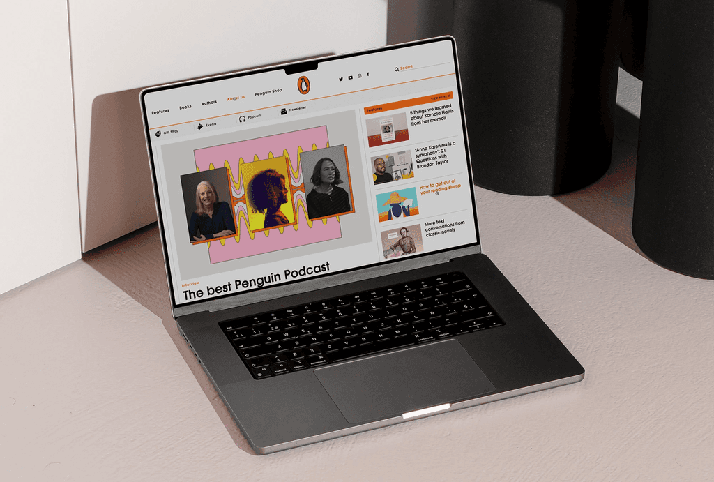
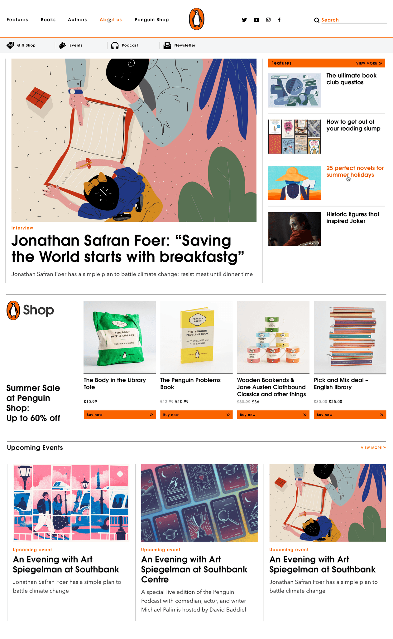
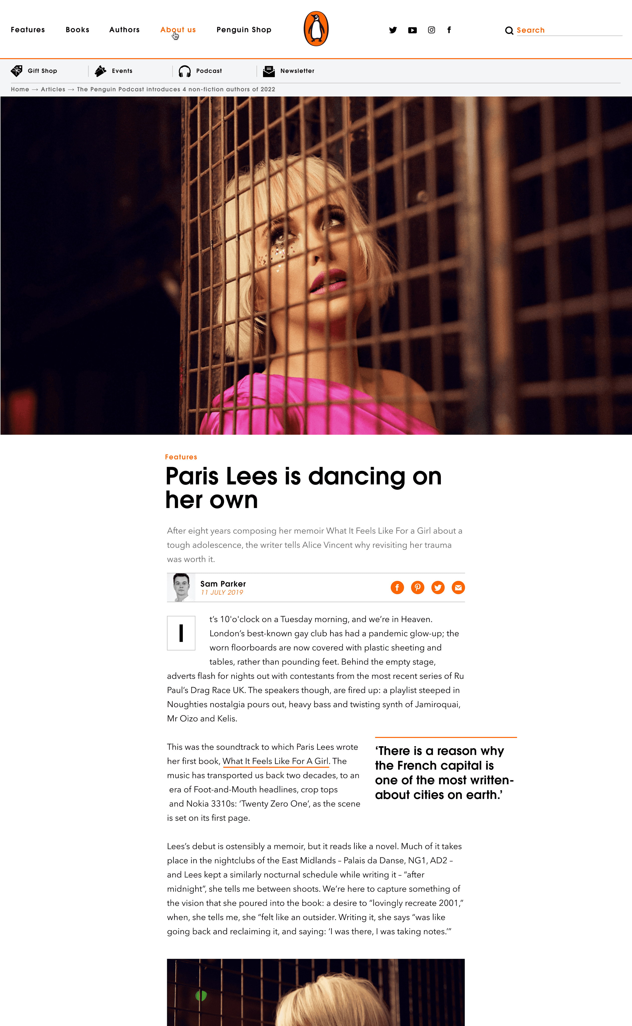
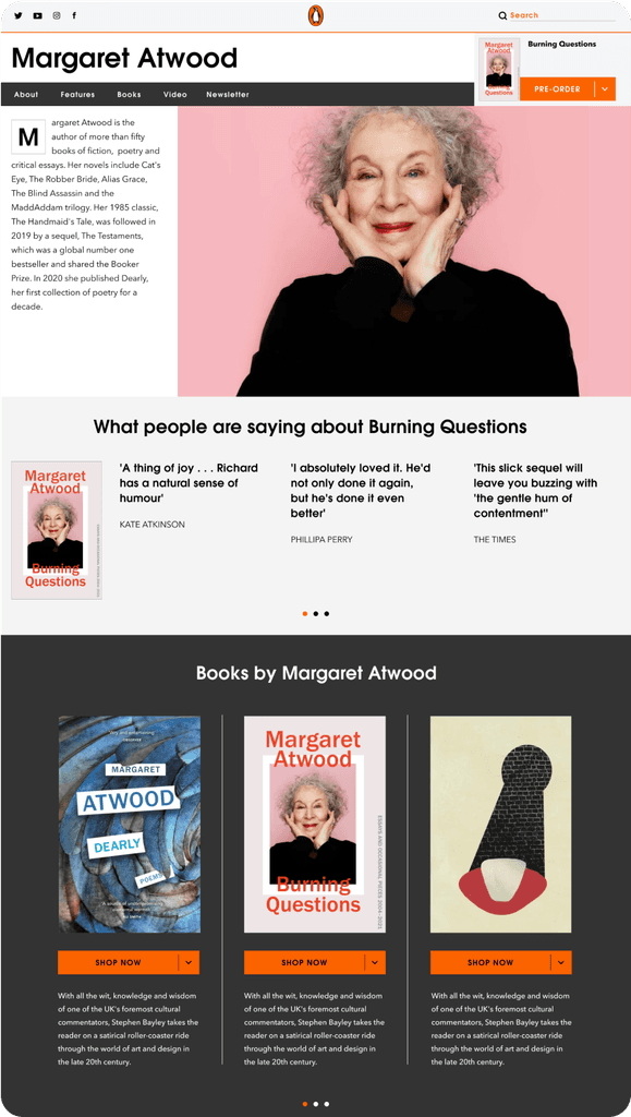
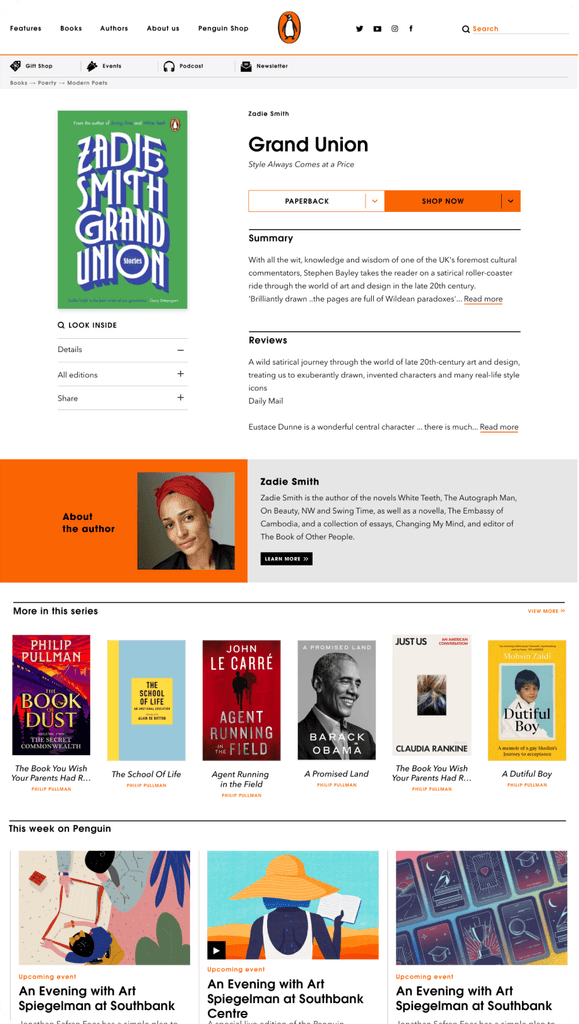
Penguin's website used to host press releases, corporate content, and a database of books. As a part of the newly formed Creative and Product teams, I was tasked with relaunching the site as Penguin's own media platform. I worked across functions to workshop and design it.
Headquarters
London, UK
Founded
1935
Industry
Publishing
Revenue
£3.54 billion (2021)
Company size
5,000+
Challenge
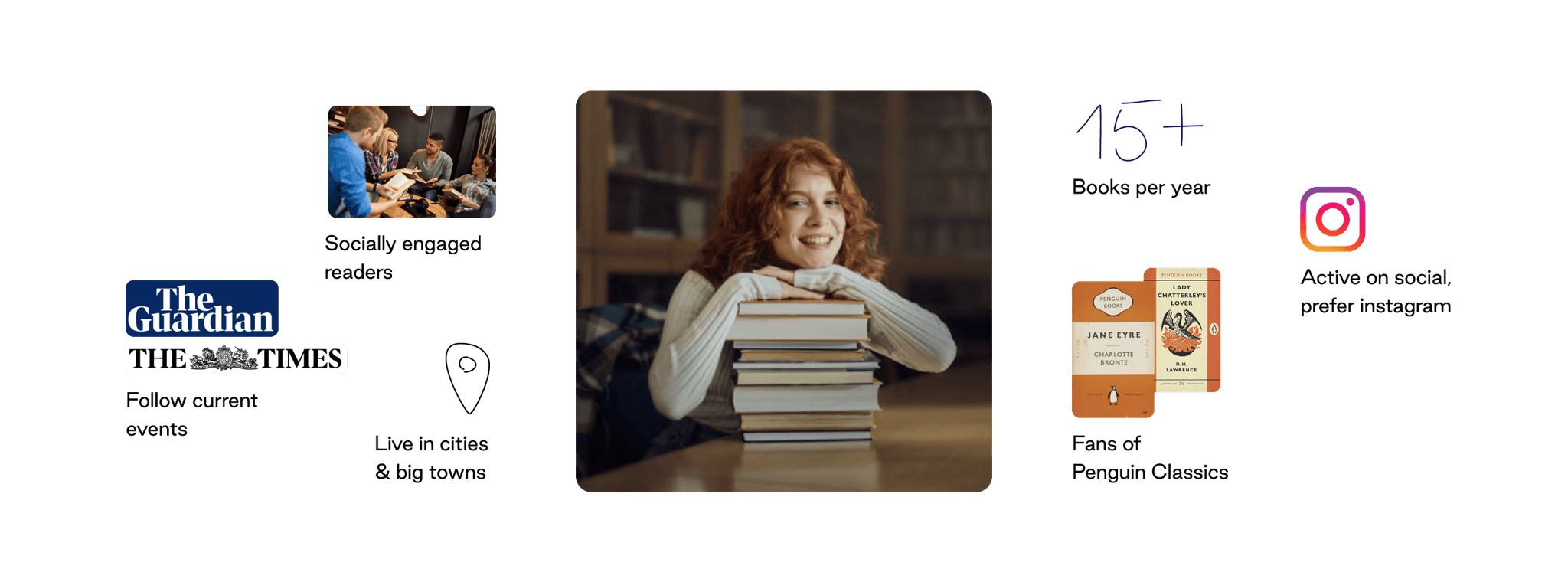
Penguin's digital strategy for 2020s is to become a #1 destination for book discovery. To make the vision come to life, I had to build user journeys that facilitate deep discovery, grow loyalty and retention.
Results
We've seen more direct visits and deeper browsing. The new UX facilitated rapid growth in newsletter subscribers. Most visitors now come to the site from Penguin Newsletter, continue to features, then browse the catalogue – resulting in more book purchases.
76%
Increase in feature views
15%
Shop revenue increase
40%
Newsletter growth
Process
Research & Analysis: I conducted user interviews, ran testing sessions of the current UX and analysed the data to understand the user needs and pain points of book discovery. I also studied competitor peoducts and industry trends to gather insights
Information Architecture: Based on the research findings, I restructured the website's navigation and content, to have curated editorial content front and centre, and product links referenced.
Wireframing & Prototyping: I designed a prototype to visualise the new curated platform, iteratively refining it based on internal and external feedback, as well as the evolving product strategy. Over time, I've built a high-fidelity design and a component library.
Usability Testing: I conducted usability tests with a diverse group of users, as well as an accessibility review with an external accessibility partner. Based on the feedback, I made necessary adjustments to the design: element tagging for voiceover users, high contrast for visual clarity, clear visual hierarchy.
Visual Design & Style Guide: As a result of the above, developed a cohesive visual language, including colour theme, typography, and iconography, ensuring consistency throughout the app. I documented it and built out a design system in Figma. I also collaborated with developers on a style guide to maintain design consistency in future updates.


“With our new editorial platform and visual language in place, the updated Penguin's digital offering clearly captures the essence of our current and target customers, as well as our values.”
Tim Lane
Creative Director | Penguin Books
Conclusion
The StreamLine mobile banking app redesign successfully addressed the usability issues, resulting in a more intuitive and user-friendly experience. The improved UX/UI design led to increased user adoption, engagement, and satisfaction, demonstrating the value of a well-designed template for UX designers.